Designing a recommendation tool for Medicare shoppers saw 36% enrollment in top matched plans
My Role
Lead experience designer (UX/UI) + Content
Collaborators
Researcher, Product manager, Medicare subject matter expert, Product designers + Legal and Compliance team
Problem
Through customer interviews, we learned a Medicare shopper’s top challenge was figuring out what insurance plan fit their needs. On average, they had 47 plans to choose from. They also experienced difficulty understanding plan benefits, costs of coverage, and comparing plans.
Desired Outcomes
Help Seniors and their Caregivers find their ideal Medicare plan based on coverage and cost fit—across a marketplace of plan options—in a simple, unified digital-first experience. We also sought out to increase shopper engagement, satisfaction and confidence that we've helped them select the right plan for their needs.
Uncover pain points in the original experience
The original design allowed people to enter their health information then provided them annual cost estimates for each plan but user testing and session replays revealed some major pain points:
It was difficult for people to discover the feature to enter their own information.
Each step in that flow had too much content that people skipped over.
People were confused by example visuals in the flow, mistaking them for clickable results.
People wanted to check which plans were covered by their preferred doctors—but couldn't.
Once someone did complete the steps, results weren’t clear what their best option was, leaving them to figure things out on their own.


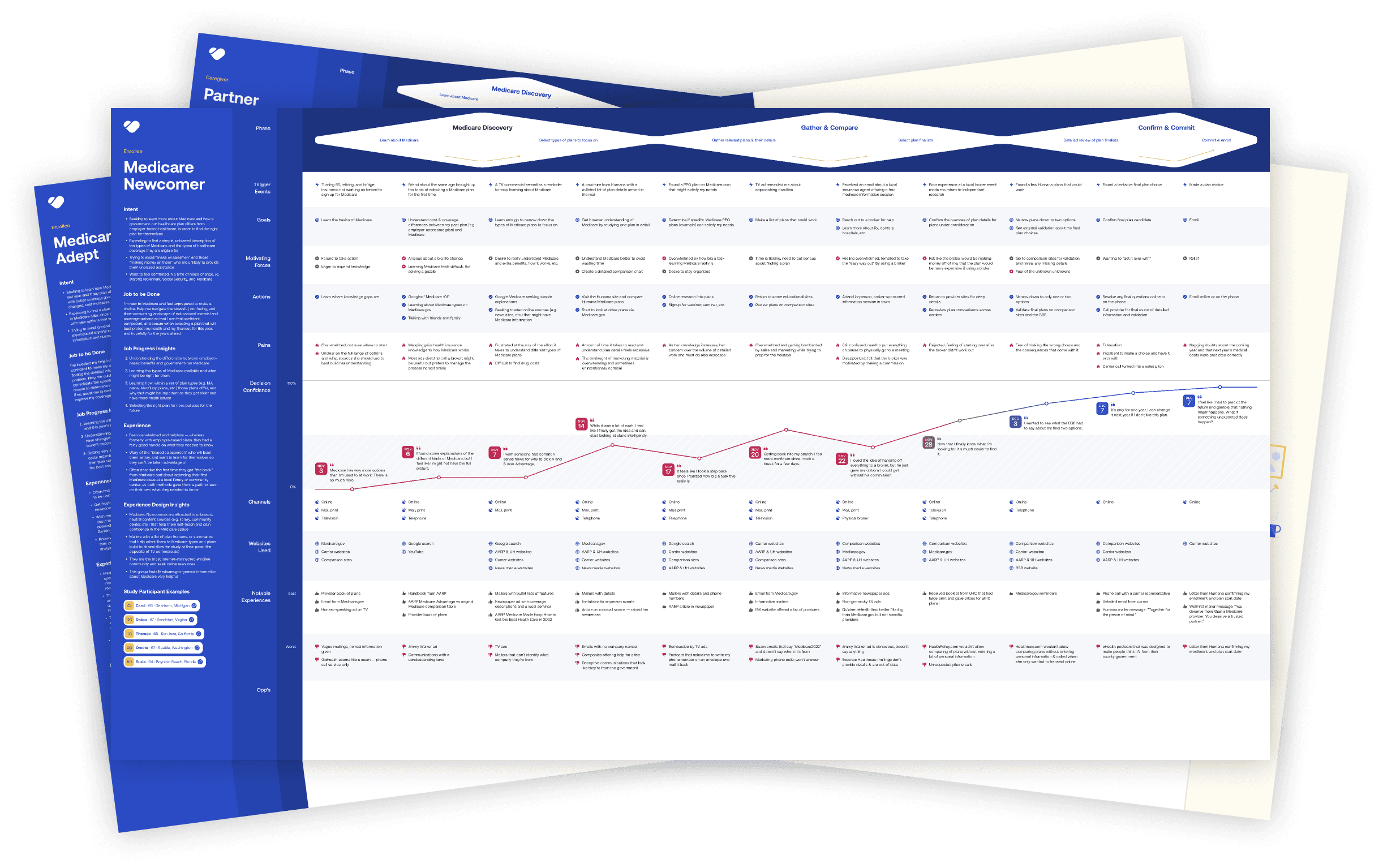
Understanding the online and offline buying journey
Mapping user journeys gave insights into the motivations, goals, and pain points across various channels and stages of the buying journey. This helped focus design efforts on optimizing for key jobs to be done throughout each phase of the digital buying journey while offering recommendations for the offline experiences other teams could improve as well.
For example, those new to Medicare had a longer purchasing journey as they required more upfront education and research to inform their enrollment decisions. As this younger senior was a target audience to support, I knew education throughout the digital journey would be critical.
Analyzing the competitive landscape
Deep dive into the user experiences of other Medicare marketplace and carrier shopping sites. Understand what they're doing well, not well, and what market gaps could we offer?
Some initial findings:
Many sites had low contrast and small fonts, not designed for the target audience.
Overall the industry used a lot of sterile language, lacked empathy.
Many competitors offered a guided option to select a plan.
Not many chat experiences - was that because of the audience or lag in the industry?
Discovered some emerging brands that were targeted specifically towards the younger seniors - this is where we wanted to take our brand.
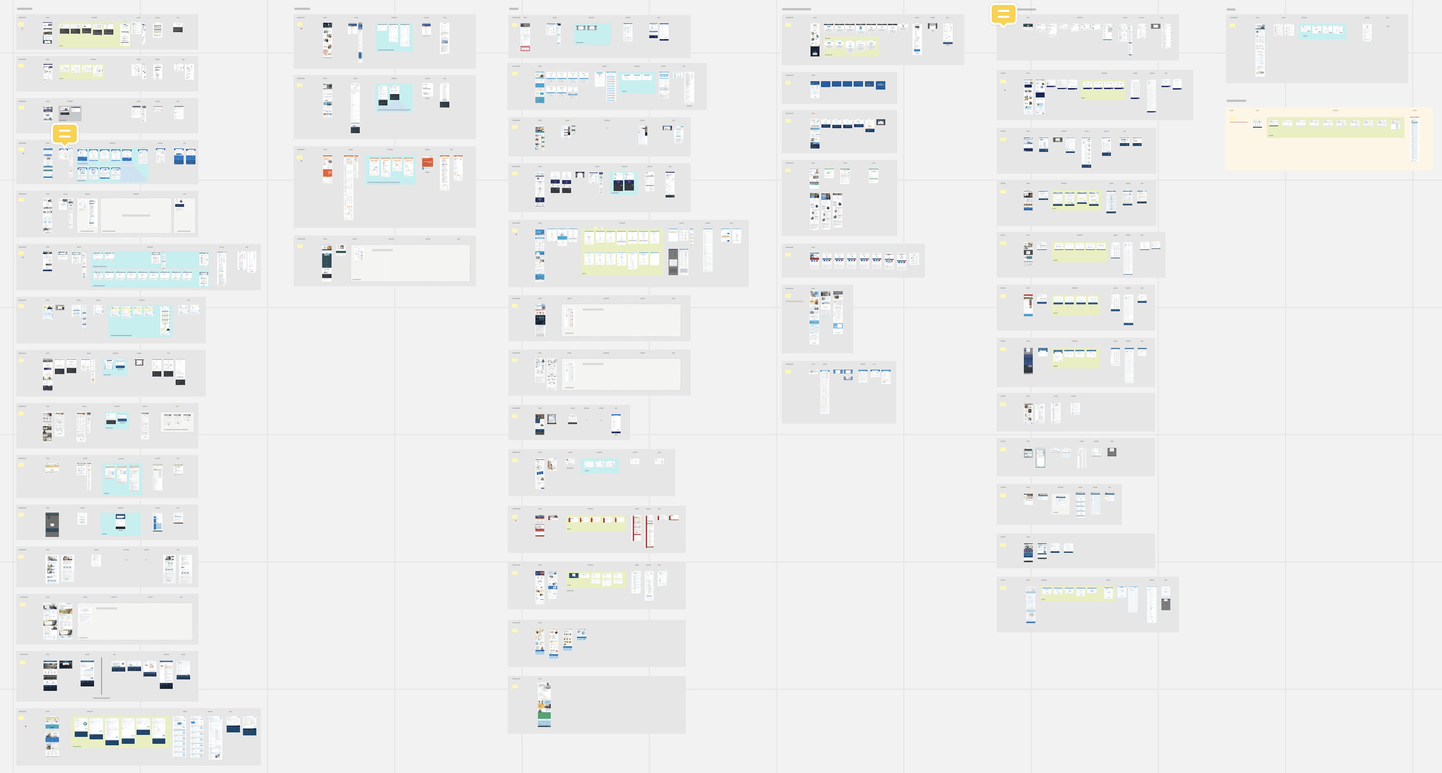
Design sprints to define the right solution
Research helped us uncover what the right opportunities were. The next phase was to ideate and validate during user testing to iterate on the right design solutions. Focused on the most risky assumptions first, in order to spend proper time defining those solutions.
Overall, conducted 9 rounds of user testing with over 110 Medicare shoppers and caregivers to help us refine through participatory design and testing sessions.
Key audiences:
Seniors aging into Medicare, shopping for the first time
Seniors between 65 - 74 (age for most online Medicare shoppers), interested in switching plans
Caregivers of Seniors who are helping research and/or shopping for a new Medicare plan for their loved one
Head-to-head comparison tests
Goal to understand: What is the optimal flow for providing a personalized list of Medicare plans to seniors and their caregivers?
Users walked through two Medicare shopping sites, one with a guided flow (questions then plan recommendation) and another flow that took them directly to results with options to filter and personalize. Tested 4 different Medicare sites, including our own.
Key takeaways:
11/12 users preferred a guided flow with questionnaire first
Users are overwhelmed by the amount of plans available
Users didn’t want to provide contact info before being able to see results
Users struggled consistently with smaller font sizes and low contrast

Participatory design sessions to build the ideal plan card
Goal to understand: What are the most important benefits and services someone looks for when shopping for a plan? (for an initial results/plan summary view)
We showed a series of benefits and services to participants and asked them to sort them into categories of importance (extremely important to not important). Then assigned Kano Qualities of delightful, basic, neutral, dislike, deal breaker. The last step, we asked them to build their ideal summary in a list view to push hierarchy.
Key takeaways:
Users consistently ranked deductible as most important to see upfront, with monthly premium and copays also ranking highly
Surprised that worst case scenario ranked last in every metric
Users typically had about 8-10 attributes in their ideal summaries

Testing the recommendation flow
Goal to understand: What is the optimal experience for a guided plan recommendation flow?
Participants walked through a click-through prototype of a guided user flow. We captured feedback about the order of questions, language, patterns for adding information and even visual direction on plan summary cards.
Key takeaways:
Users preferred to start with the guided flow but still want an option to skip
Content needs to be as succinct as possible with option to get more info
Get the easy questions out of the way first, ease them in with lower cognitive effort
Users intrigued by data imports to speed up process but weary to do so
Design, Test + Iterate
With each design sprint, we added additional areas to test until we had completed several rounds of end-to-end user testing for the full new experience.


New experience
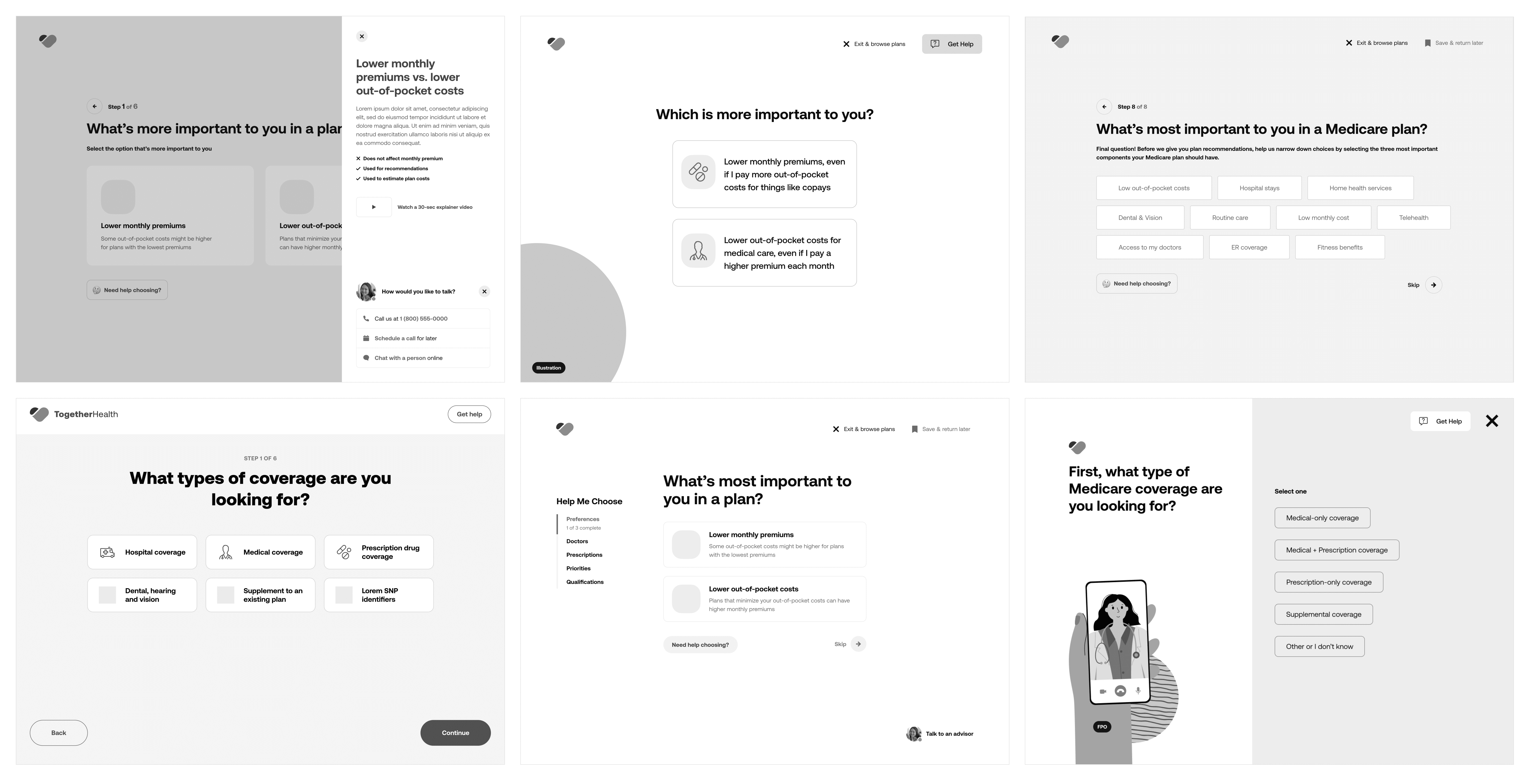
Help me choose flow
Implemented a guided experience to help users easily find their ideal Medicare plan based on their coverage and cost needs.
Simple view with one question per screen
Large click/tap areas with base 20px fonts specific for older audiences
Conversational content design, with feedback built-in for user responses
Introduced new functionality such as a provider lookup tool for network checks, ability to save progress and return later. Designed contextual help at each stage for deeper education about why each question was being asked and how it related to quotes (though this final feature was not developed at launch)
Plan recommendations
Introduced a clear top match for users who provided their personal wants and needs so there was no question what plan(s) were best suited for them personally.
Scannable page with the use of rows
User's wants/needs displayed within the coverage details so they can see associated costs and savings (when compared to their current plan)
Illustrations brought attention to headings/sections, visually broke up very dense content pages and elevated the brand
All illustrations in the final designs created by the talented Julia Cone.


Results
Successfully launched the new experience in time for the Medicare open enrollment period (annually from October 15th through December 7th). Some key results achieved during this window:
81.5% of all online enrollments utilized the new "Help me choose" flow that guided users to a plan recommendation.
36% of users enrolled in the recommended plan.
130% growth in enrollments YoY.
Design-related wins
Worked with engineering to implement design system for faster and more consistent development.
Visual design contrast met AAA accessibility standards.
Laid foundation for building a brand-agnostic design system with reusable patterns to be used on Benefytt's other digital properties.